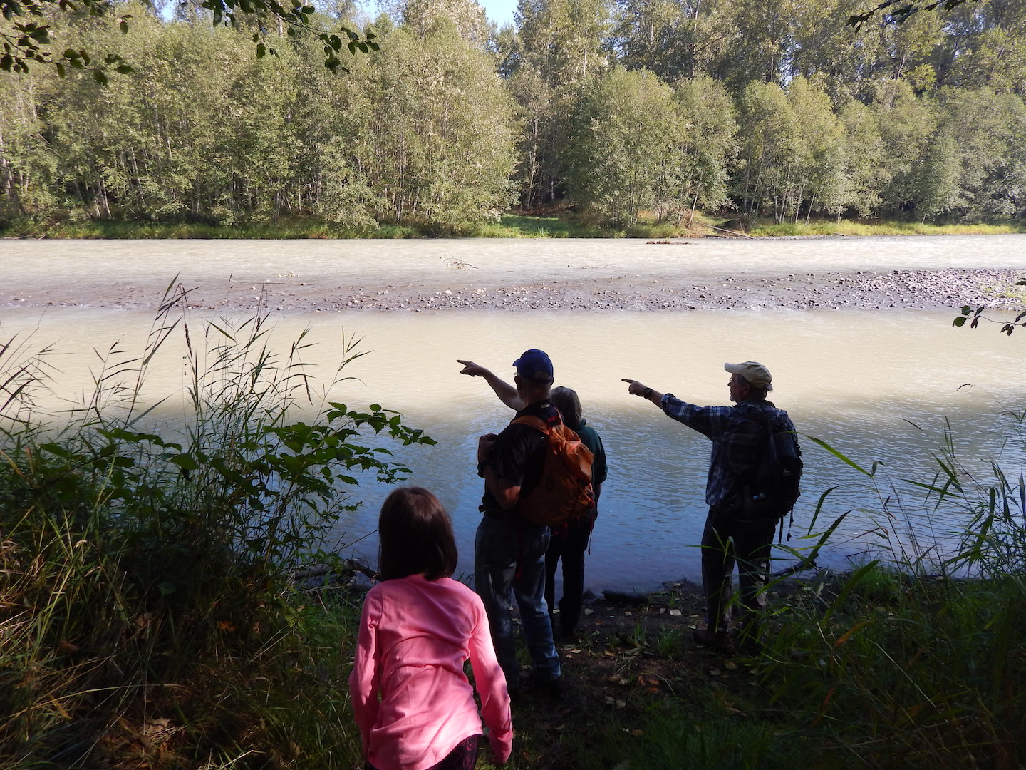
The Nisqually River Education Project (NREP) has been hard at work for over 25 years collecting data on the health of our local waterways. Classrooms of students have tested the water twice a year at dozens of sites along the Nisqually River. The NREP gives students and teachers all the training and supplies to complete these water quality testing field trips- all that’s needed in return is the data students collect.
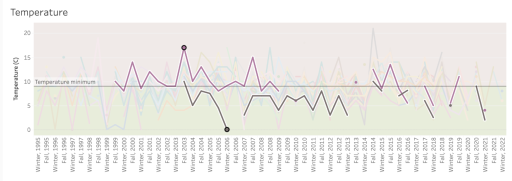
The challenging thing about the NREP’s data is that with 71 sites across the watershed, over 25 years, measuring 8 different parameters (dissolved oxygen, temperature, pH, nitrates, turbidity, total suspended solids, fecal coliform, and biological oxygen demand, each with their own scale), it was hard to see what that data actually looked like! The raw data table alone is currently 65 columns by 552 rows- almost impossible for students to make sense of, let alone analyze. The big questions that students and teachers often want to know (How does our site compare to others? How has it changed over time?) couldn’t be efficiently answered (or in some cases, answered at all!) by just a table.
So how did the NREP solve these issues? Using the data visualization software Tableau, an interactive map was created so that teachers and students could quickly get a sense of the health of their site compared to others and see how it has changed over the years. Simply click on a site (or select it from the drop-down menu) to see each of its parameters graphed over time. The site’s data will be highlighted, and all other sites will appear translucent, so you can still see how your site compares to others.
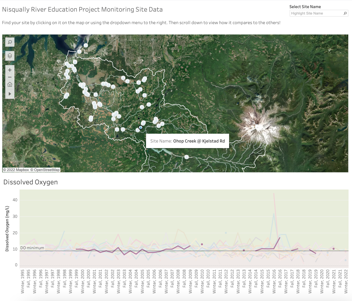
Multiple sites can be selected for easy comparing; simply click on one site, then hold down the control (or command) key while clicking another.
You can also download any site’s graphs by selecting the site (or sites!) you want, then scrolling to the bottom of the graphs and clicking the “Download” button, then selecting the PDF option.
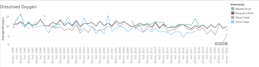
Although the map is useful now, it’s far from finished! The NREP is currently working on a set of criteria to be used for the elimination of “suspicious” data, or data we believe to be unlikely or a mistake. We are also working on an additional set of graphs that show the average data for 4 distinct parts of the river system: Yelm Creek, Ohop Creek, the Mashel River, and the Nisqually mainstem.
Now, the NREP wants to hear from teachers! How will you use the map? Do you have specific lesson plan ideas? Would you like any help developing lessons to utilize the new mapping tool?
The NREP is also looking for feedback from partner agencies about the map. This data is shared with many state, federal, and tribal agencies; we want to know how our data can be useful to you too!
You can leave feedback below in the comments, or send your thoughts to julia@nisquallyriver.org
To use the interactive map, click here to be taken to the NREP’s website! The map works best on a computer, rather than a phone.
Vocabulary
parameter: something that can be measured and used for analysis
dissolved oxygen: the amount of oxygen gas in water that can be used by fish and other aquatic life
pH: a measure of the relative acidity or alkalinity of water
nitrates: a form of nitrogen that is needed for many aquatic plants to grow
turbidity: how cloudy the water is
total suspended solids: a dry-weight measure of the suspended particles that are not dissolved in a sample of water
fecal coliform: a type of bacteria that are present in the intestines of warm blooded animals, including humans
biological oxygen demand: the amount of oxygen consumed by the respiration (breathing) of microorganisms in the water
data visualization: the representation of information in the form of a chart, diagram, picture, etc.